You’re never more in love with your new home or apartment than on the day before you move in. Think freshly painted bare walls, polished floors, shiny windows.
But let’s get real. It’s impossible to keep it that perfect. Life finds a way to fill and dirty every space.
Despite that, it’s fully possible to create a home you feel good about, one that shows off your vision for living. Interior stylist Nicole Wear, who co-owns Friday and Company with her husband, principal broker Calle Holmgren, says ruefully, “I find it fascinating that most people wait until they’re about to sell their house before they make it the house they want.”
We reached out to Wear and a few other home stagers for decorating tips—and there are a few universal concepts. The focus on home staging may be to maximize sale potential, but many of the design principles can make your living space fabulous on a day-to-day basis.
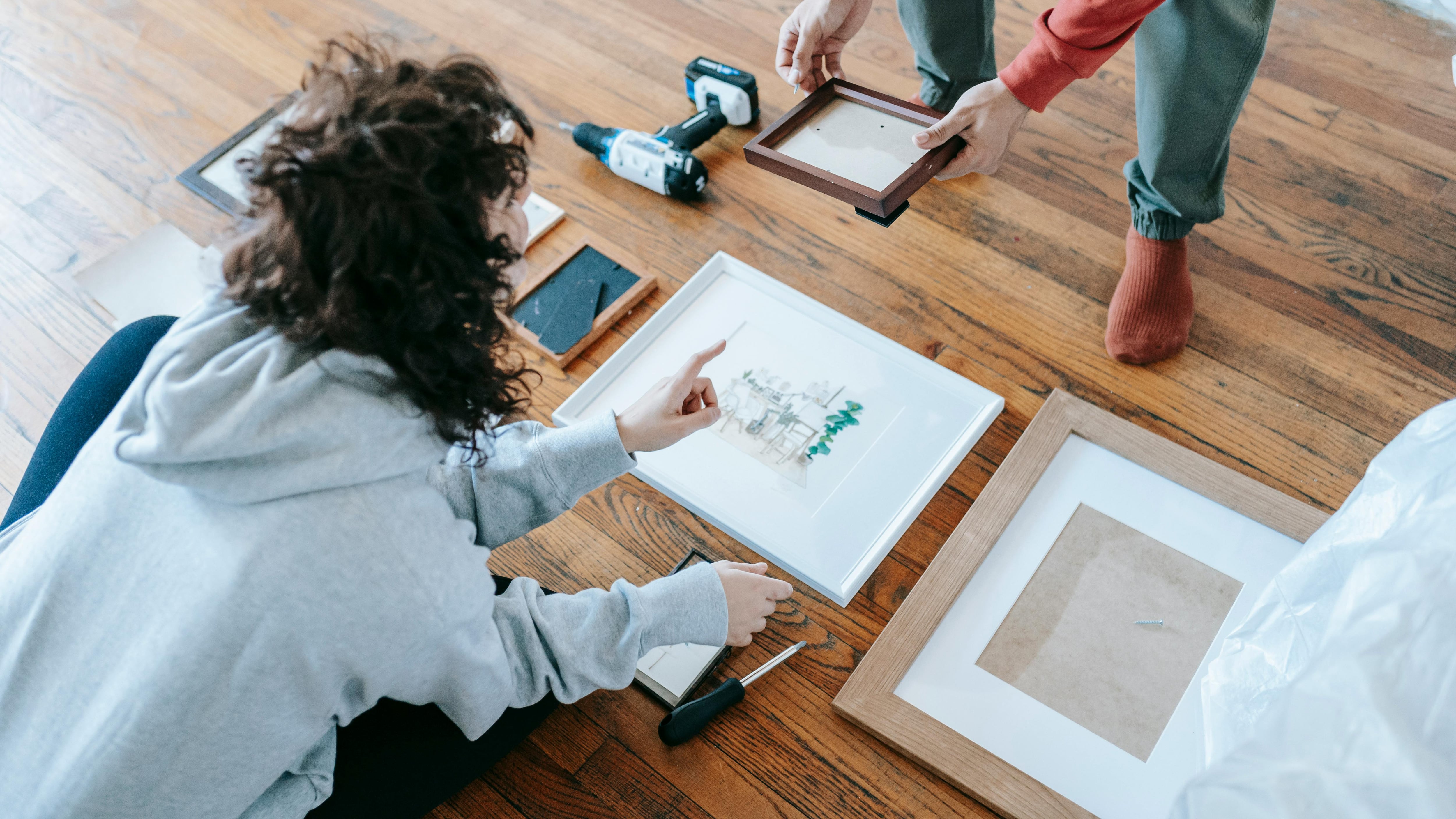
They all agreed that the first step is simple: Take the first step. Even the smallest action is better than nothing. When things pile up, you tell yourself you’ll deal with the piles later, eventually repaint that magenta wall, or switch out the brain surgery-bright overhead light—so start the process.
There are endless tips for getting rid of things you don’t need, don’t have space for, don’t “spark joy.” A quick way to start streamlining is to tell yourself that you’re just putting stuff away in a box or two, not getting rid of it.
All you have to do is:
Start fresh.
Even if you’ve lived in your place for years, you can begin to make progress by clearing out one room, one cupboard, one drawer. “When everything feels cluttered it makes it really hard to start,” Wear says.
Empty it out, clean it thoroughly, and then if reasonable, give the walls or doors a fresh coat of paint. “The biggest bang for your buck,” Wear says, “is paint.” She also suggests examining your trim and keeping it in good shape. Regular maintenance over time is less overwhelming than tackling a huge project. Same goes for clutter. Commit today that for each new thing you bring into your place, you’ll get rid of at least one other, Wear advises.
Find flow.
It’s ideal if moving from one room to another doesn’t feel like Lucy opening the wardrobe and falling into Narnia (as thrilling as that experience might be). Rooms within sight lines should “play nicely together,” says Angie Meade of Home Simple, the Portland staging company she’s owned for 15 years. “Don’t have it look like one room has never met the other.”
This means noticing if the colors, patterns, and styles from room to room are radically different. It might be slightly uncomfortable to see vintage florals and old wood in the kitchen leading to a glass and steel dining room.
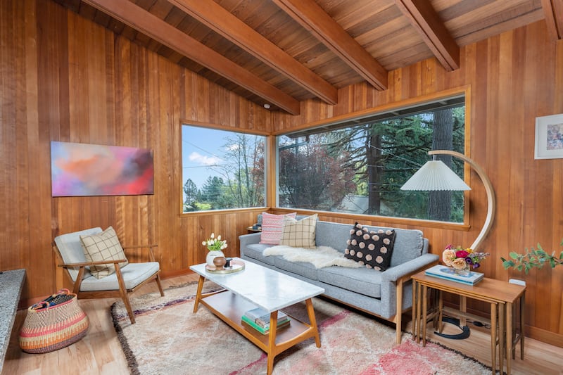
Consistent flooring helps build a cohesive flow. Rugs layered on top of hardwoods can define individual rooms while maintaining cohesiveness throughout your space.
Keep balance.
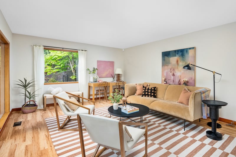
Consider the principle of yin and yang with color, shape, texture, and height. Variety brings personality, but too much in one place is overwhelming. If you have a striking black couch, add black accents on wall hangings or somewhere else in the room.
The same idea goes for shape. Don’t have everything be square or round. You can aid this balance, Meade says, with rugs, round or oval coffee or side tables, or a variety of pillows. “The idea is to have a variety for the eye,” she explains.
With height, pick out the thing in the room that’s the tallest—a plant, a floor lamp, or a piece of art—and use that to provide contrast with other objects, so there is a range for the eye to settle on. That said, Meade says one common mistake people make is to hang artwork too high. “A good rule of thumb is the center of the piece should be 57 inches off the floor,” she suggests.
Exercise control.
What you leave out is just as important as what you put in. If you find a pattern you’re enamored with, remember absence makes the heart grow fonder. Start small and add more, rather than paper all your walls and ceilings with candy cane stripes.
The same goes for furniture: If you like a couch from a particular brand, Meade suggests having no more than two pieces from the same collection. “You don’t want anything to look like a showroom,” Meade says. You want a “found” look, meaning the fixtures and accents reflect your life and your experiences.
Embrace color.
Marta Burlinska, owner of local Polka Dot Interiors, has been working in staging for eight years. She’s become known as “the color lady,” someone who sets out to tell color stories in every room.
While many think the best strategy is whites and grays for neutral backgrounds, Burlinska excels at using colors as neutrals. “I’ve been influenced by the weather,” she says. “Colors work against the gray outside. It’s a Portland thing.”
Meade emphasizes the power of three colors in every room, but adds that “simple white duvet covers and sheets are worth their weight in gold.”
Focus on the small stuff.
“Think of light fixtures and hardware as jewelry, accessories for your house,” Wear says. These are the ways you can make your personality shine. Meade suggests: “Embrace hooks—especially in small spaces and guest rooms. These can be both practical and attractive. Use hooks to hang a cute bag and store winter hats and gloves. Baskets are also a great way to conceal things you need but don’t necessarily want to see.”
Go bold.
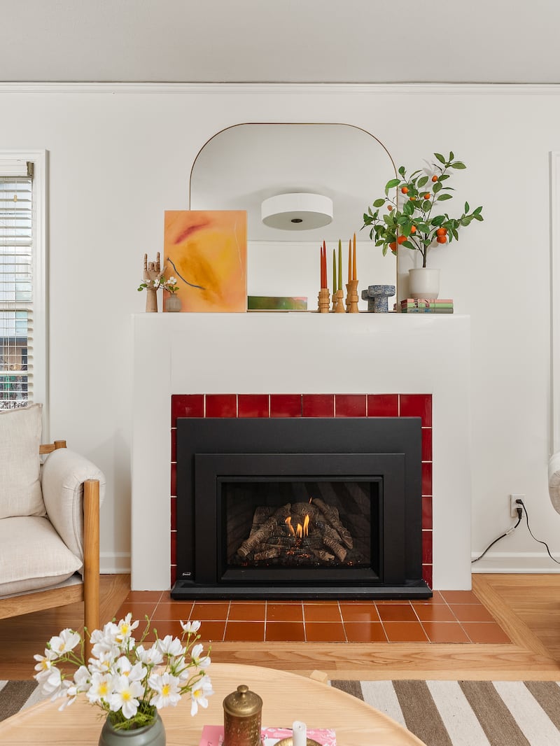
Sometimes rules are made to be broken; don’t be afraid to tune in to your creativity. “You don’t want to be generic,” Burlinska says. Wear points out how lucky we are to live in Portland with so many incredible local artists, vintage shops, and makers of all kinds. “People are surprised at how affordable local art can be,” she says.
The most important thing is to make yourself happy in the space you’re in.
This story is part of Nester, Willamette Week’s annual home magazine. It is free and can be found all over Portland beginning Monday, Sept. 23, 2024. Find your free copy at one of the locations noted here, before they all get picked up! Or, order one through our store.
