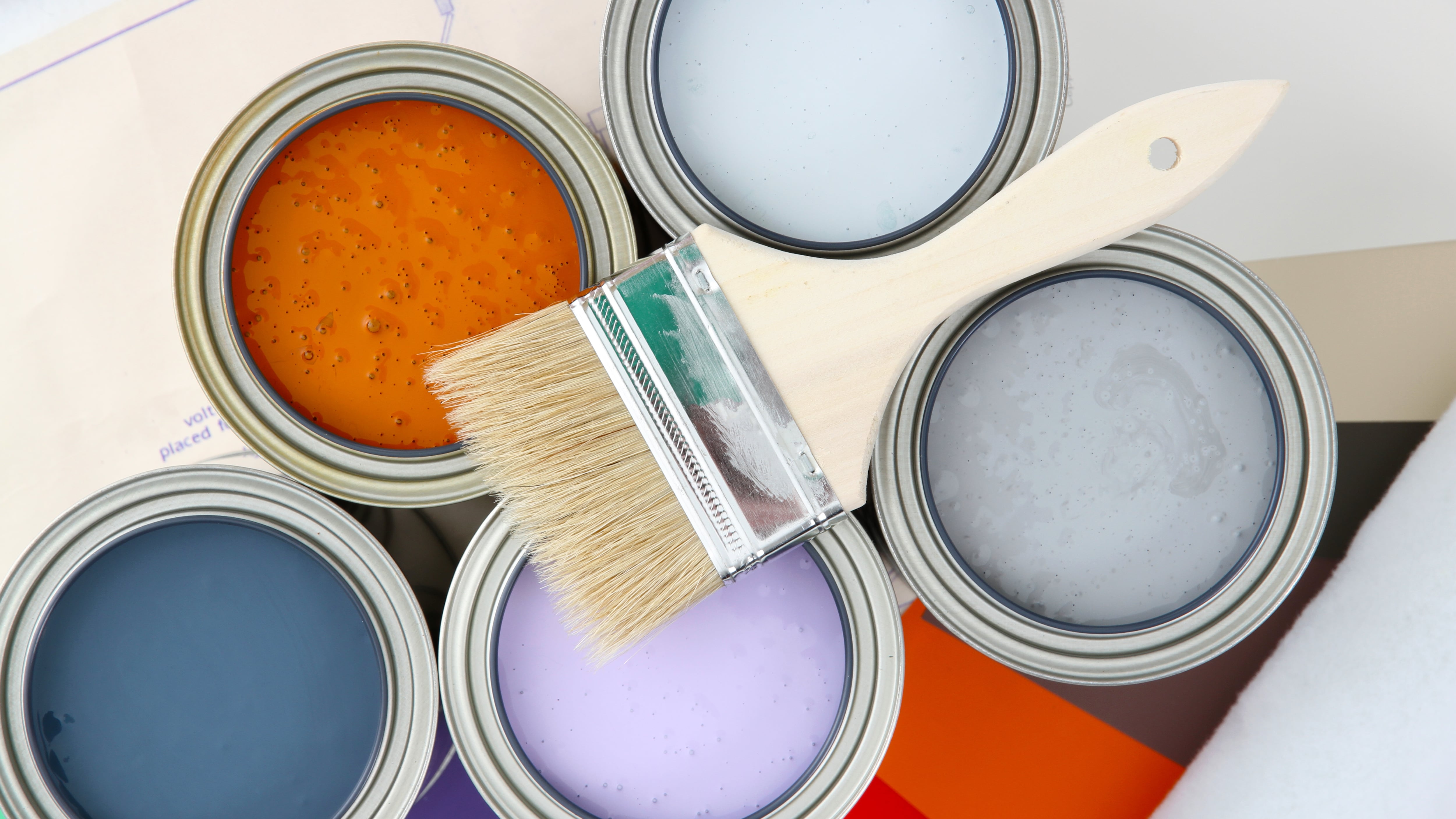
Of all of the elements of design, color can be the most confounding. Picking interior color can feel like a constantly shifting universe, and a rainbow of choices can inspire and overwhelm. Too little color and a room can feel lifeless and bland. Too much color and a space might seem childish or chaotic instead of dialed in. Should you pay attention to trends? How should we even begin?
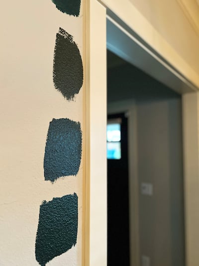
If color has you confounded, you might consider calling on one of Portland’s color experts—designers and industry leaders who have spent a lifetime developing an understanding of the way light reflects off objects. These professionals can save you a lot of time and indecision as you play with paint swatches on your walls—before you take the leap with full cans of paint. We reached out to three of Portland’s color experts to get a little advice. While all three agree an important first step is testing colors and picking a palette—that group of colors that complement each other in a space— they’ve got a few other ideas to keep in mind as well.
Start with what you love and see how colors activate each other.
“The most effective interiors create a sense of harmony,” says Puji Sherer, a local architectural color expert who also runs Puji Studio.
According to Sherer, most people tend to paint the ceiling one color, then use another for trim, then get a little more adventurous on the walls—but there can be more fun incorporated into those choices. “It’s really a relationship you are building—to make a home feel intentional and not like an afterthought,” Sherer says.
Sherer loves starting with a piece of art a client loves, or a family heirloom, or furniture that they have invested a lot in, and then offers suggestions for colors that complement. If they don’t yet know what colors they love, she asks them to pull images onto a Pinterest board based on what feels good, and without dictating the style too much. Then she looks at those images to see if certain trends emerge, or whether the home dweller responds a lot to certain colors or certain types of color (think dark and moody, gemtone, or light and bright). “You really want the colors you use to activate each other,” Sherer says.
Look at what inspires you, but be open to change.
Picking colors is always about homing in on how the individual responds. “People bring their cultural differences, emotional responses, and personal history to how they interpret it,” says Brandi Katherine Herrera, the color consultant and interior decorator behind color-forward business A Lively Manner. “It’s really about taking a wide look at a person’s style, and how that person communicates with color and wants to experience color in a space.”
Inspiration can be drawn from any creative field—not just the interiors you’ve seen that you’ve gathered on your Pinterest board—like the worlds of fashion, music, and fine art. It’s all fair game when you’re figuring out a color palette, she says.
In addition to full interior projects, Herrera offers a popular service called the “Gut Check,” where she meets with clients, often virtually, to evaluate existing color palettes in real time alongside other furniture, objects, materials, and hardware. Her practice has a special focus on developing palettes and mood boards based on universal design, which makes accommodations for age, size, ability and disability. “Adjusting color to suit the needs of individuals is important—color perception is not universal,” Herrera says. “How we perceive color changes as we age, and our ability to perceive color is also impacted by certain conditions.”
Consider trends, but go with what you feel.
“Color can be a puzzle but it’s always a solvable one,” says Kristin Van Buskirk, a former color design director for Nike who now does color consults as part of her West End retail home design shop, Woonwinkel.
Color trends aren’t wholly irrelevant—they do reflect the zeitgeist, Van Buskirk says, but the best results come when you reflect on the values you want your home to embody. Her goal is always to educate people so that the next time around, they will feel more confident going through the process themselves.
To aid in this discovery, Van Buskirk meets with clients in the space to determine how much light it gets and which direction it faces (each will alter how color acts in a room), and develops a palette based on color psychology—how color impacts human behavior. “The most important thing I ask clients is how they want to feel in a space—that affects color choice dramatically,” Van Buskirk says.
Once she has tested a color at different times of day to see how it interacts with changing light, Van Buskirk is more confident about a winning combination and brings some of the home dwellers’ art and accessories into the space to gauge how they enhance, diminish, or do nothing for the color. “You can see it when it happens,” she says. “The colors really come out to play when partnered with the right friends.”
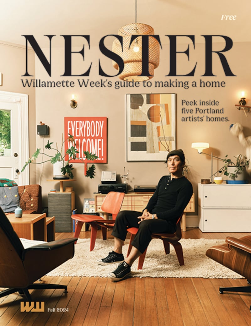
This story is part of Nester, Willamette Week’s annual home magazine. It is free and can be found all over Portland beginning Monday, Sept. 23, 2024. Find your free copy at one of the locations noted here, before they all get picked up! Or, order one through our store.