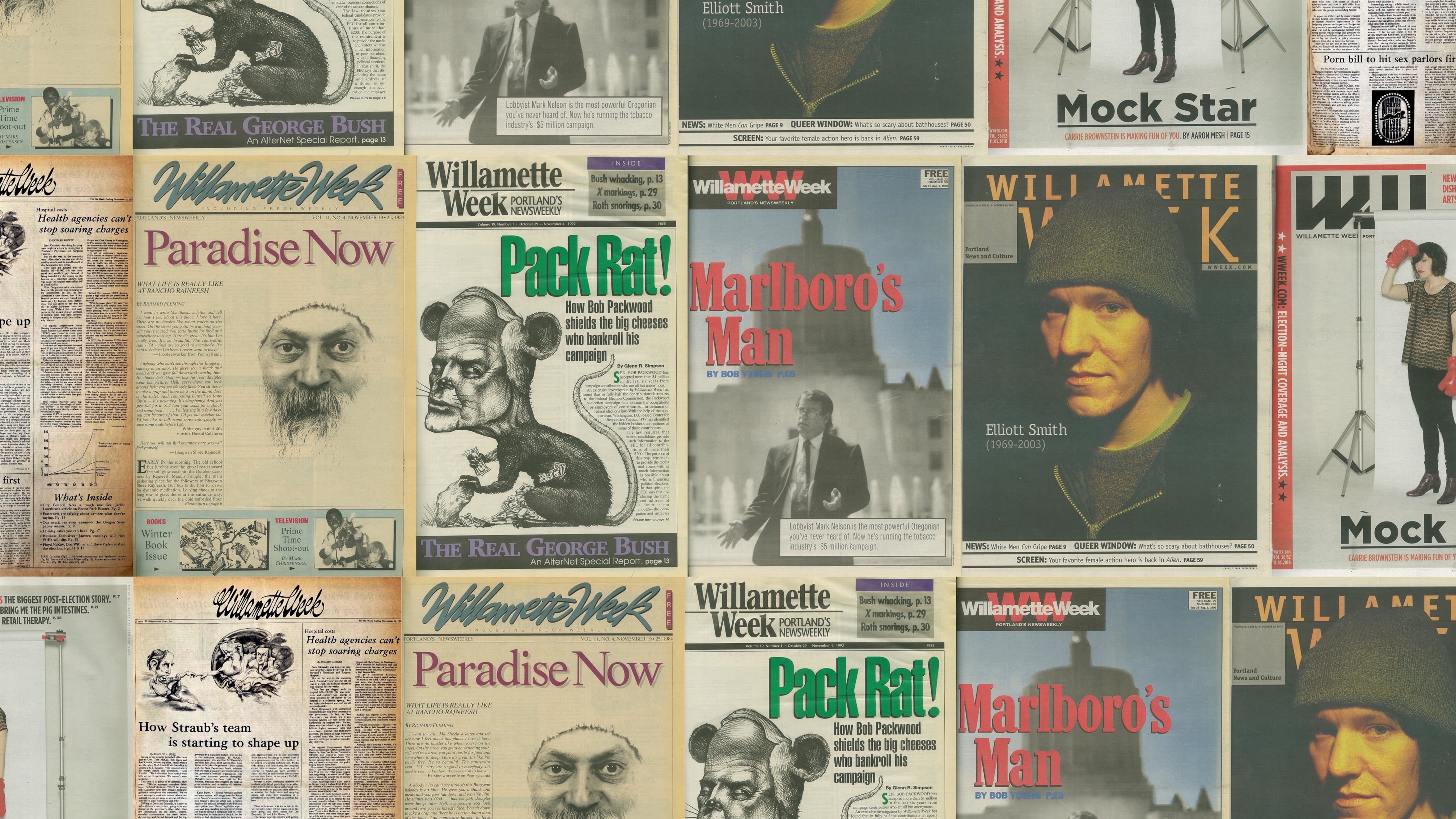
As one would expect for a gracefully aging institution, the aesthetic of Willamette Week has evolved over the years—broadsheet to tabloid, new designs to fit the decades. Along the way, the logo, or flag as it’s known in the newspaper biz, has taken new shapes as well.
Here’s an oral history of how the WW logo changed throughout the decades, as told by the people who raised and lowered the flags.

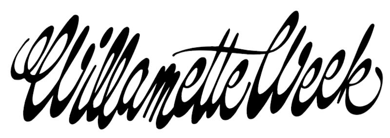
1. 1974: The Original, designed by Byron Ferris
“We had five name candidates [for the paper], which we typed on index cards and showed to people we knew. The winning name, Willamette Week, was the inspiration of two men, separately. They were Ted Hallock, a prominent public relations executive, and Doug Babb, who would become the paper’s production manager.
“[Graphic designer] Byron Ferris’ studio was in the Dekum Building. When he unveiled his design of the logo, he explained that he had done a reverse in having the vertical strokes be slender, and the bottom and top elements be fat.” —Steve Forrester, co-founder of Willamette Week

2. 1980: The Cursive Update, designed by Steve Bialer
“When I arrived as art director at Willamette Week many years ago, it was a little bit off the map. Portland was not a trendsetter, and while it had seeds of the future, it smelled like corn flakes from the brewery and was a little sleepy.
“WW was a broadsheet publication with a fairly traditional newspaper format filled with writing by very smart people digging in, under and around all kinds of interesting places and things. I wanted the design to highlight this new spirit.
“The logo was a vertical, scripty thing that was to me more Hallmark Card frumpy than streetwise. My plan was to develop a new design (keeping the script idea for continuity) that was more energetic and contemporary.
“There was no money budgeted to do this.
“I contacted Tim Girvin, a Northwest lettering designer who I knew had done some great, splashy lettering projects. Think layers of bright colored ink script soulfully melting into rice paper, and he had also done other significant logo projects.
“He agreed to do a version on spec that I could present to the powers that be at the WW. We found one that seemed right because I thought it captured some of the spirit of the emerging Portland, and I presented it. They liked it.
“I got back to Tim and struck a deal. We cleaned up the artwork and I stuck it on the top of the front page (with melted wax as we did in those days) and WW had its new logo.” —Steven Bialer, WW art director, 1980–1981

3. 1989: The Serif Typeface, designed by Elizabeth Anderson and John Laursen
Originally appeared in Willamette Week, Nov. 2, 1989:
“The new look is the handiwork of two Portlanders: Elizabeth Anderson, a well- regarded graphic designer, and John Laursen, a book designer whose company, Press 22, is known for the quality of its work. The charge for these two was to come up with a flag that, from a design point of view, would take Willamette Week into the ‘90s. In addition, Anderson and Laursen were asked to design a flag that would represent the seriousness of purpose, the intensity of effort and the somewhat rebellious nature of this newspaper.” —Mark Zusman, WW reporter, 1980–1981; editor, 1981–present,; owner, 1983–present

4. 1994: The Bold Red, designed by Kat Topaz
“We took the existing cover logo and kept it more consistent from week to week. Back then, the cover was very much a posterlike cover, and the logo could easily get overshadowed by the art. By making the logo a consistent color each week, and by having it contrast with the cover art, was one way we tried to make it easier for a reader to see WW at a glance, especially when displayed next to other free papers. We also made sure the covers highly contrasted from the previous week’s cover, had one main central image, and were not too dark.” —Kat Topaz, WW art director, 1993–2000, 2019

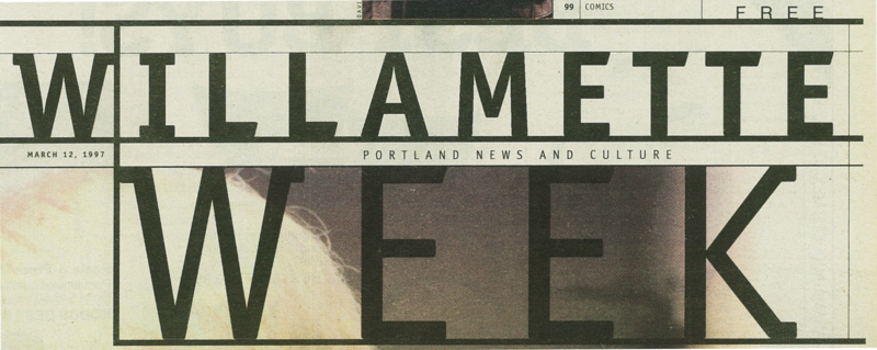
5. 1996: The Black Line, designed by Johnson + Wolverton
“It’s hard to stress just how big of a deal this was at the time. First, the new look made for a much different cover approach. Not only was it generally more journalistic, but it also greatly reduced the time needed to put together a cover. When the redesign launched, the most shocking element of the redesign was the thick black line.
“The design made such an impact, folks wanted to be part of the paper. We were seen as more relevant, even receiving national attention. Print magazine did a story on us and showed examples of our covers and designers. (Production then consisted of nine full-time designers; we averaged over 100 pages each week.) The cover now had its own look, and we finally moved away from a posterlike cover, and took clues from the web. Keep in mind, when this redesign launched, the web was a new thing.” —Kat Topaz

6. 2007: The Current Logo, designed by Leopold Ketel & Partners
“I remember being really impressed with the agency we were working with—not only were they talented, but they seemed to really understand the legacy of the logo they were creating. I also remember all of us, internally, being really excited about the new look, but knowing there would be haters—and there were, but they faded fast. More than anything, it felt like a shot of adrenaline to get to produce a paper with something so bold and modern.
“They really put a lot of thought into the style of the two different W’s. They styled the angles of the italicized one to read as more digital, putting a stake in the ground that WW was invested in publishing both in print and online. Of course, WW’s website was nothin’ new. Brian Panganiban [the paper’s information services manager] could tell you it had been around at least a decade at that point. But instead of leaning into a feeling of heritage, they were leaning into the future. That, in itself, felt bold.” —Maggie Gardner, WW art director, 2004–2009

